How to color grade game screenshots comes down to four moves: fix the white balance and exposure first, build contrast with a tone curve, tint the shadows and highlights separately, then export at the right size. Game engines render neutral color, so an unedited capture looks washed out next to official key art. About 20 minutes per screenshot once you know the sliders.
The catch is that a game screenshot is not a camera photo. It is usually an 8-bit PNG or JPG with no RAW latitude, and the HUD sits right on top of the frame you are trying to color. Push the grade too hard and your ammo counter turns orange.
Table of Contents
- 1What You Need to Color Grade Game Screenshots
- 2Choose a Color-Grading Workflow
- 3How to Color Grade Game Screenshots Step by Step
- 41. Duplicate and Protect the Original Screenshot
- 52. Set White Balance and Correct Exposure
- 63. Build the Look: How to Color Grade Game Screenshots With Layers
- 74. Add Color Contrast and a Consistent Mood
- 85. Apply Sharpening, Grain, and Finishing Effects
- 96. Check the Edit and Export the Final Image
- 10Common Mistakes
- 11Frequently Asked Questions
- 12What is the best way to color grade game screenshots?
- 13Do I need Photoshop to color grade game screenshots?
- 14How do I make a GTA screenshot look more cinematic?
- 15Should I use Curves or Hue and Saturation for game screenshots?
- 16How do I keep colors from looking over-saturated?
- 17What size should I export an edited game screenshot?
- 18Conclusion: Start With a Neutral Screenshot
What You Need to Color Grade Game Screenshots
You need very little. A screenshot file, an image editor, and about twenty minutes.
- A non-destructive capture. Work on a copy. Keep the untouched original so you can compare against it and re-grade later without re-taking the shot.
- An editor. Photoshop is the obvious one, but DaVinci Resolve, Krita, GIMP, and Lightroom all handle the same adjustments. The tool table below covers which to pick.
- Adjustment layers. Every correction sits on its own layer with a blend mode and an opacity value, so you can dial any single step back to zero instead of rebuilding the edit.
- A display you trust. A laptop panel at 40% brightness will make every grade look muddy. Bump brightness to something near your normal viewing level before you judge color.
There is no RAW option here unless your capture tool outputs it. A PNG screenshot holds 256 values per channel, and pushing shadows hard on a file that starts life with only 8 bits per channel is how you end up with banding in a flat sky.
Choose a Color-Grading Workflow
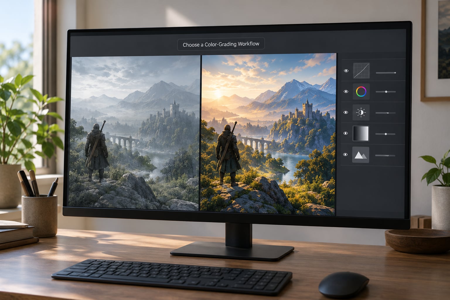
Three workflows get the job done, and the right one depends on how much control you want over each step.
Camera Raw Filter (Filter > Camera Raw Filter) is fastest for a beginner. It opens a whole grading panel with a point curve, an HSL panel, and three color wheels in one dialog. Good for a single screenshot, bad for matching a set of twenty because it is hard to reuse.
Adjustment layers in Photoshop is the standard route and the one this guide uses. Curves, Vibrance, Hue/Saturation, Color Balance, and Photo Filter all work as layers with an opacity value attached, so each step stays reversible.
A single solid color layer on Exclusion blend mode is the three-click shortcut. Fill a layer with one color, set it to Exclusion, and drop the opacity until the shadows and highlights separate. It is fast, it is not precise, and it is a reasonable last resort when you need an image right now.
| Editor | Cost | Best for | Curve control |
|---|---|---|---|
| Photoshop | Paid subscription | Full control and a reusable action | Yes, on Curves and Levels |
| DaVinci Resolve (free) | Free | Real three-way color wheels, scopes | Yes, with a custom curve tool |
| Lightroom | Paid subscription | Grading a whole set consistently | Yes, plus Color Grading panel |
| Krita / GIMP | Free | Doing this without Adobe | Yes, via Curves |
| Snapseed / Lightroom Mobile | Free | A quick grade on a phone before posting | Limited, preset-driven |
Photoshop is not required. The free options do every adjustment described below, they just label the menus differently.
How to Color Grade Game Screenshots Step by Step
Six steps, in this order. Skipping ahead to step 3 is the most common mistake, and it is why beginner grades come out muddy and washed out.
1. Duplicate and Protect the Original Screenshot
Open the capture, then immediately add a background layer. Rename it something like original – do not touch and put it at the bottom of the stack.
Work on a Smart Object copy of the top layer if you want to sharpen it. The background stays your reference: toggle its visibility on and off while you grade, and every time you do, ask whether the edit actually looks better or just looks different.
2. Set White Balance and Correct Exposure
Open a Curves adjustment layer and set the Channel dropdown to RGB. Place one point near the far left at input 0 and drag it up to output 25 to 35. That lifts the black point, kills the crushed-shadow look, and gives the image somewhere to breathe.
Add a second Curves point near input 235 and pull it down to about 200. Those are your clean highlights. A screenshot with a blown-out sun or a white HUD panel usually has clipping in the red channel, so check each RGB channel separately rather than the composite.
For a yellow cast, the fast fix is a new adjustment layer set to Filter > Other > Color Balance, then push Cyan into the Shadows and Yellow into the Highlights. Small moves, under 10 each, fix a cast that a full temperature slider makes worse.
Check that the sky, road markings, and any readable text on screen still hold detail. If a minimap icon or a health bar number is a solid block of one color, you clipped it.
3. Build the Look: How to Color Grade Game Screenshots With Layers
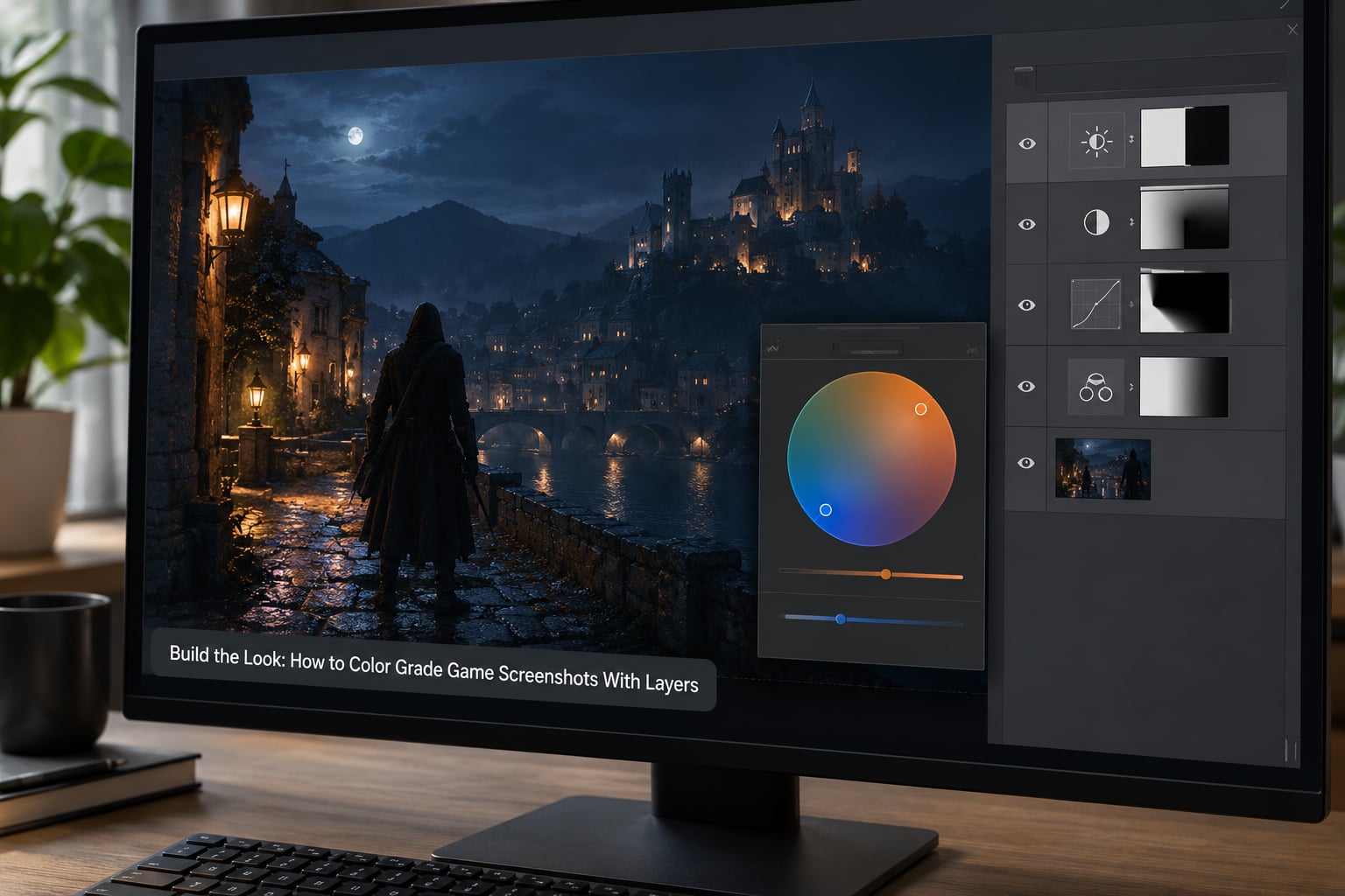
Now stack the look. Each of these sits on its own layer with the blend mode set to Normal and an opacity value you can pull down.
- Curves adds the S-shape. Steepen the midtone pull gently, then step back. A hard S on an 8-bit file posterizes the sky.
- Vibrance raises saturation on the dull colors first and protects already-saturated ones. Keep it between 10 and 30. A Saturation layer nudges every hue equally and is what turns grass into radioactive green.
- Hue/Saturation targets one range. Pull green down 10 and yellow down 5 to stop foliage from shouting, and leave orange alone unless skin or a HUD icon looks wrong.
- Color Balance gives you the shadow and highlight tints. Midtones stay neutral.
Set each layer’s opacity to a round number while you work, then make it ugly on purpose at 100% so you know the adjustment is doing something. Values between 5 and 20 are normal for a grade. A layer at 100% is usually a mistake on a screenshot.
4. Add Color Contrast and a Consistent Mood
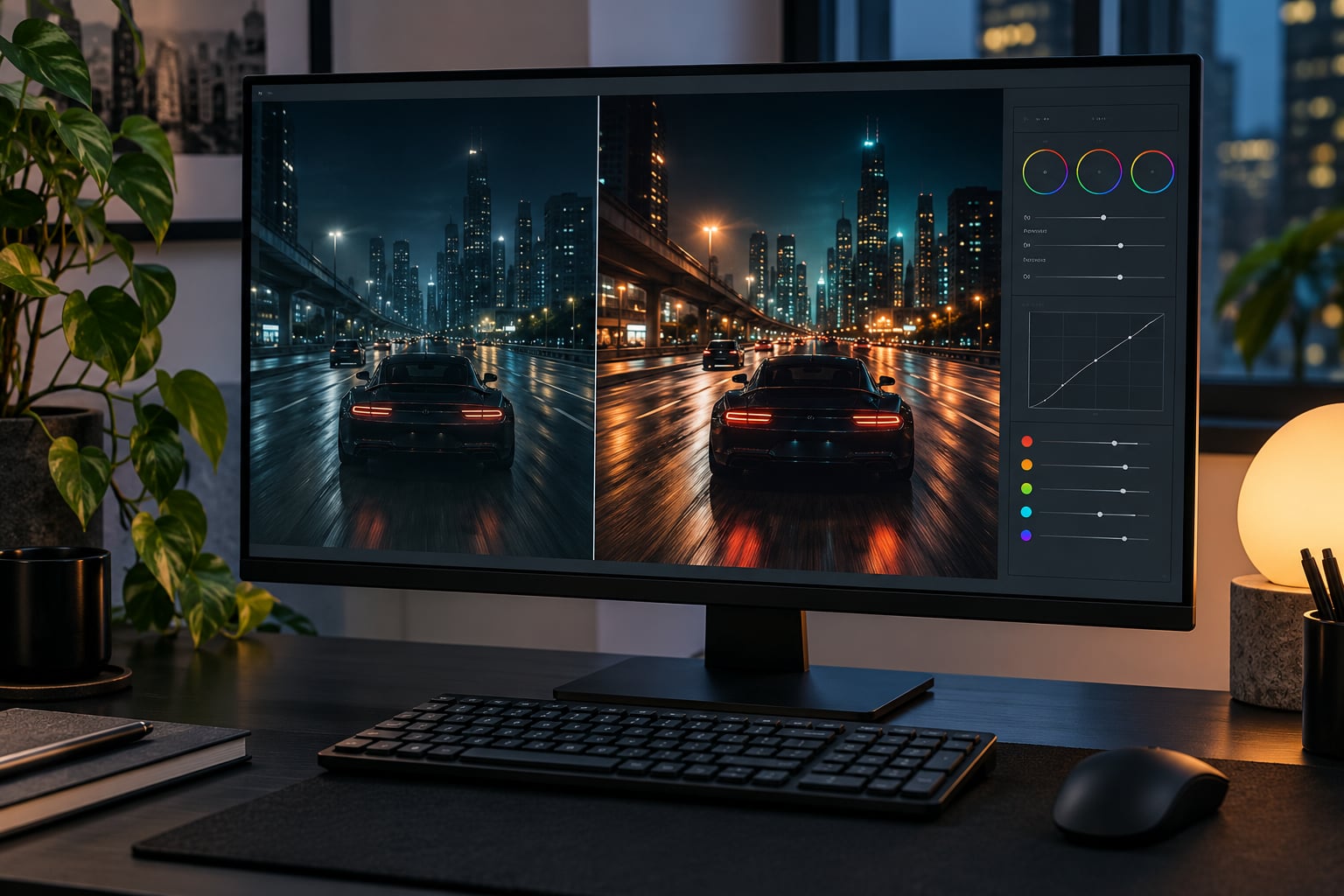
Color contrast comes from tinting the shadows one color and the highlights the opposite one. In Color Balance, push Cyan or Blue into the Shadows and Yellow or Orange into the Highlights by small amounts. That is the classic teal-and-orange look, and it is also how a night scene gets its cold blue base with warm street lighting on top.
Spend your tint on one range, not both. A frame that is teal in the shadows and teal in the highlights has no contrast left, it just looks tinted.
For a GTA-style night scene, keep shadow saturation between 5 and 15, drop highlight saturation slightly, and hold the overall brightness down. For daylight driving shots, do almost nothing to white balance and grade contrast only. It is worth shooting the same frame under a couple of different in-game presets and comparing them before you commit to a look.
One genre note: a saturated grade is not automatically a cinematic one. Horror and survival looks usually run desaturated with green or cyan in the shadows, which reads as uneasy rather than pretty.
5. Apply Sharpening, Grain, and Finishing Effects
Add a final sharpening layer, convert it to a Smart Object, then run Filter > Sharpen > Smart Sharpen. Amount around 40 percent with a radius of 1 to 1.5 pixels is plenty for a screenshot at native resolution. More than that draws bright outlines around every HUD icon and weapon edge.
Grain does two jobs here. It hides the banding that shows up in flat skies once you have lifted the blacks, and it makes the image feel less digital. A Noise layer at 3 to 5 percent on Overlay blend mode, or a soft-light grain texture at low opacity, is enough.
Finish with a subtle vignette if it helps the frame read on a phone. Keep it well under 30 percent and feather the edges, or it looks like a Photoshop filter sticker.
6. Check the Edit and Export the Final Image
Toggle the original layer back on at full size. This is the step people skip, and it is the only honest test of whether the grade helped.
Zoom into the brightest and darkest areas and look for hard edges where a smooth gradient used to be. Then zoom the whole image out to thumbnail size, because that is how most people will actually see it in a post or a Discord channel. A grade that only works at 100% will not survive the feed.
Export as PNG when you are posting somewhere that will not recompress it, or as JPG at quality 90 to 95 for social platforms. Make sure the color profile is sRGB, since that is what every phone and browser assumes. If you are building a set, export at the same resolution and the same file type every time.
Common Mistakes
Colors look over-saturated. Drop the Saturation layer first, since Vibrance and Saturation stack. Then pull Vibrance down until the frame still reads. Over-saturated blacks are usually a Vibrance layer sitting at 100 percent opacity.
Blacks are crushed. The shadows are pinned at zero. Lift the black point on your Curves layer to 25 or so, and check the red and blue channels individually for clipping.
Highlights are clipped. Pull the top point down, or lower the Highlights slider in Levels. A white HUD panel with no detail left in it is the tell.
The HUD turned orange. This one comes up constantly. An aggressive teal-and-orange grade pulls every warm UI element toward the highlight tint, and on competitive shooters a heavy grade can make on-screen information harder to read. Mask the HUD, or accept a gentler grade.
Halos around edges. Smart Sharpen radius above 2 pixels, or clarity cranked too high. Drop the radius and the amount together.
Visible banding in the sky. The source is 8-bit and you lifted the blacks hard. Add the grain layer from step 5, or apply a small amount of dithering before saving as JPG.
The set does not match. Every shot got graded slightly differently. Build the edit once, then save it as an action or a preset and run the same values across the batch.
You edited the only copy. If you did not start with a background layer, close the file without saving and start over. That mistake is cheap to undo now and expensive later.
Frequently Asked Questions
What is the best way to color grade game screenshots?
Correct the white balance and exposure, then build the look in layers: a Curves layer for contrast, Vibrance for selective saturation, and Color Balance for the shadow and highlight tints. Keep every layer’s opacity low and work non-destructively so you can compare against the original at any point.
Do I need Photoshop to color grade game screenshots?
No. DaVinci Resolve, Krita, GIMP, and Lightroom all have curves, saturation, and split-toning controls. Photoshop is convenient because every adjustment is a layer with an opacity value, but the same six steps work in the free tools with different menu names.
How do I make a GTA screenshot look more cinematic?
Lift the black point slightly on a Curves layer, then push Cyan or Blue into the shadows and Yellow into the highlights using a Color Balance layer. Keep shadow saturation between 5 and 15 and drop overall brightness a little. The cold-night, warm-light split is what sells the look.
Should I use Curves or Hue and Saturation for game screenshots?
Use both, in that order. Curves handles contrast and the black and white points, and Hue/Saturation lets you fix one color range that is fighting the frame, such as neon green grass or a red HUD icon. Curves shapes the image; Hue/Saturation cleans up specific colors.
How do I keep colors from looking over-saturated?
Use Vibrance instead of Saturation, because it lifts dull colors first and leaves the already-strong ones alone. Keep it between 10 and 30, and check the result at thumbnail size. If a layer is set to 100 percent opacity, that is almost always the cause.
What size should I export an edited game screenshot?
Export at your monitor’s native resolution for viewing on a desktop, or crop to 16:9 at around 1920 by 1080 for social posts. Use PNG for archives and a JPG at quality 90 to 95 for feeds, and keep the sRGB profile so colors do not shift on other devices.
Conclusion: Start With a Neutral Screenshot
Your first action is not a color adjustment. It is the white balance and the black point, on a duplicate layer, with the original left visible underneath.
From there, add color slowly in layers you can switch off one at a time, keep shadow saturation low, compare against the original at full size and at thumbnail size, and only export once the frame still reads clearly. A grade that looks good at full screen and unreadable in a feed is not finished.